
























Improving User Onboarding and First-Time Purchases
PlusGold, a fintech company specializing in gold investments, faced a high uninstall rate and low engagement with first-time purchases.
PlusGold
(Product)
2024
(Year)
(Website)
plusgold.inScroll Down
Objective
Increase on-boarding conversion rate.
What I did
Led user research
UX flows and wireframes
Validated prototypes with users.
Final UI designs, covering edge cases.
Understanding the Problem
User Research
Method
Process
Conducted user calls to gather insights directly from users. (38 users)
Mapped out the key problems through interviews and identified.
Key Insights
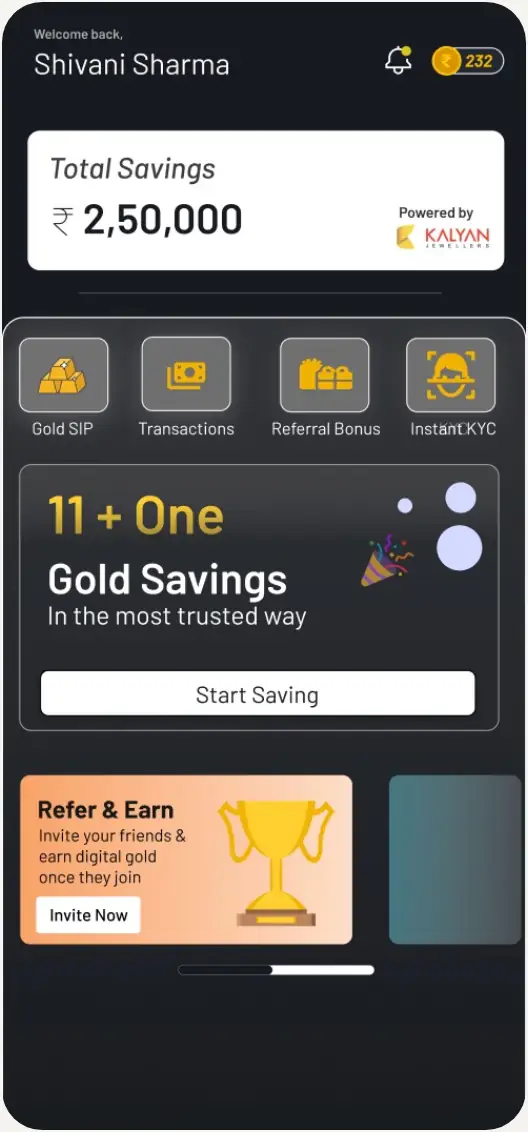
1.Users were unaware of the product offerings.
Previous Home screen
2.App doesn’t seem safe
3.Complex journeys in the starting
User purchasing behaviour
•Purchases were only made on special occasions.
User Flow
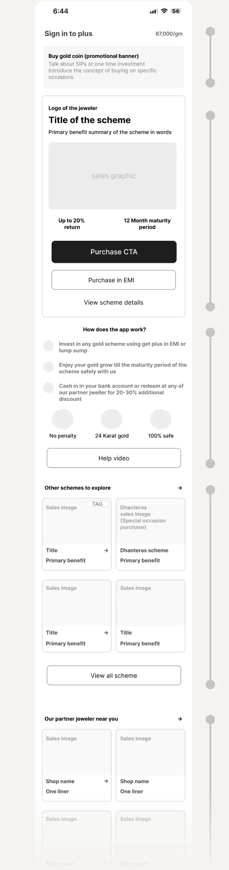
Streamlined the user experience by mapping out clear, intuitive user flows for better navigation and engagement.
Wireframing
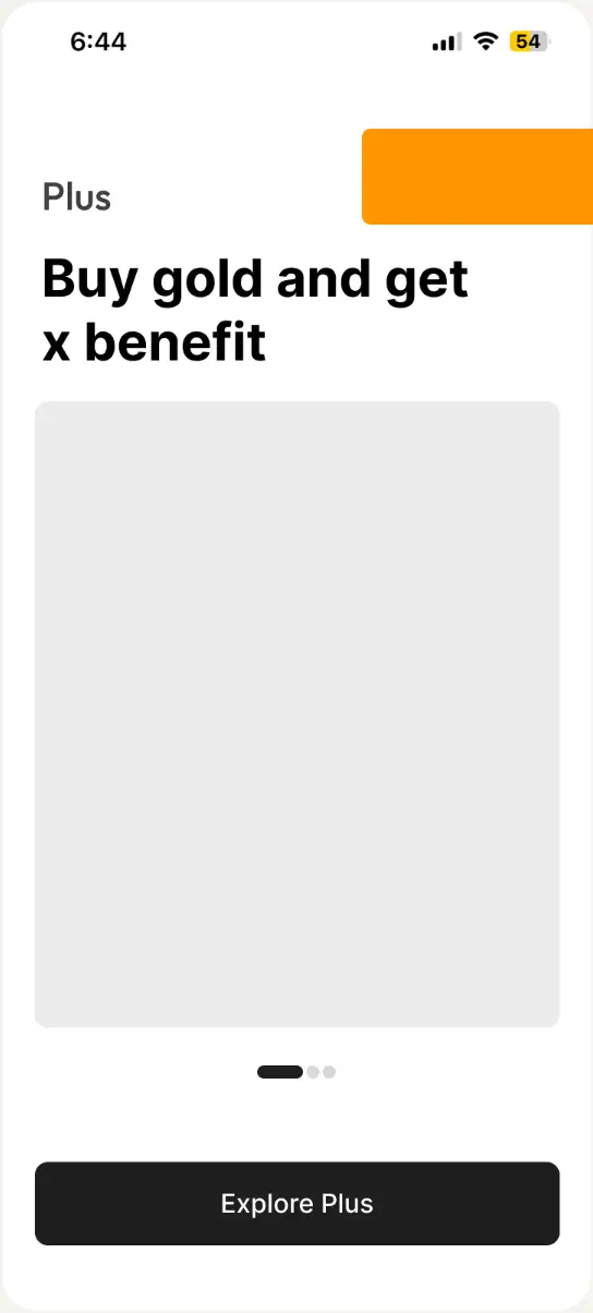
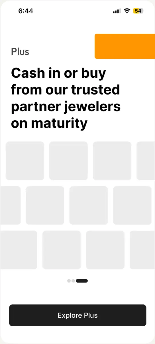
Onboarding - What app does?
Offering
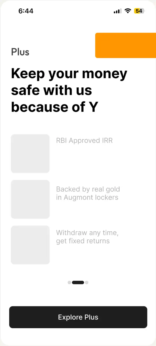
Safe
Reedeem
Improved UX writing
I kept it simple, explaining how our product is trustworthy by focusing on its solid partnerships.
Home Screen
Purchase EP & Trust building
Purchase EP & Trust building
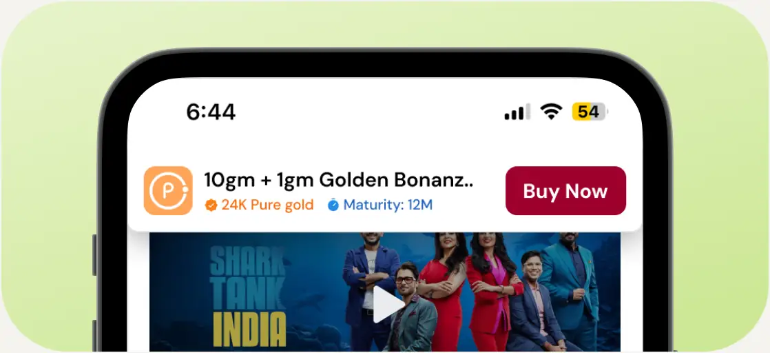
Toolbar and banner
KYC was removed to minimize complexity
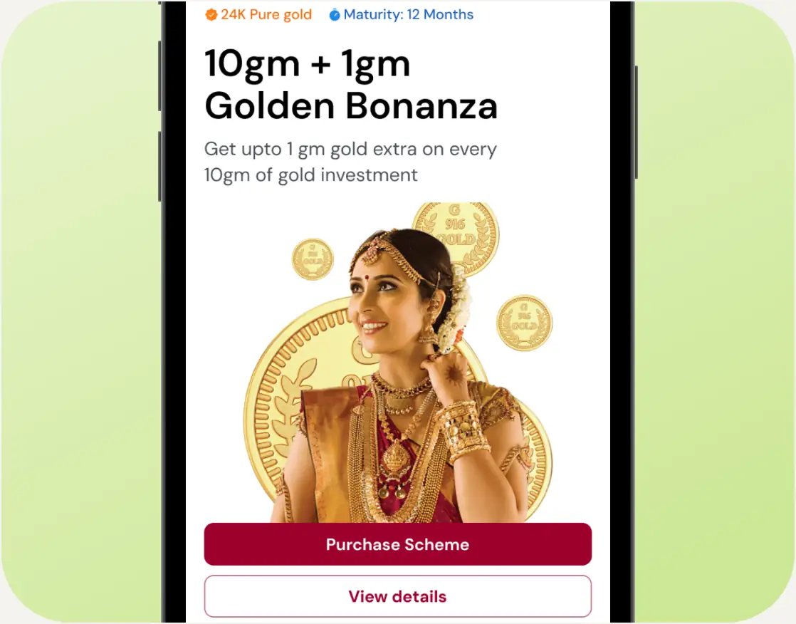
Purchase CTA
60% of the screen consist information about scheme and primary CTA to push user to make their first purchase
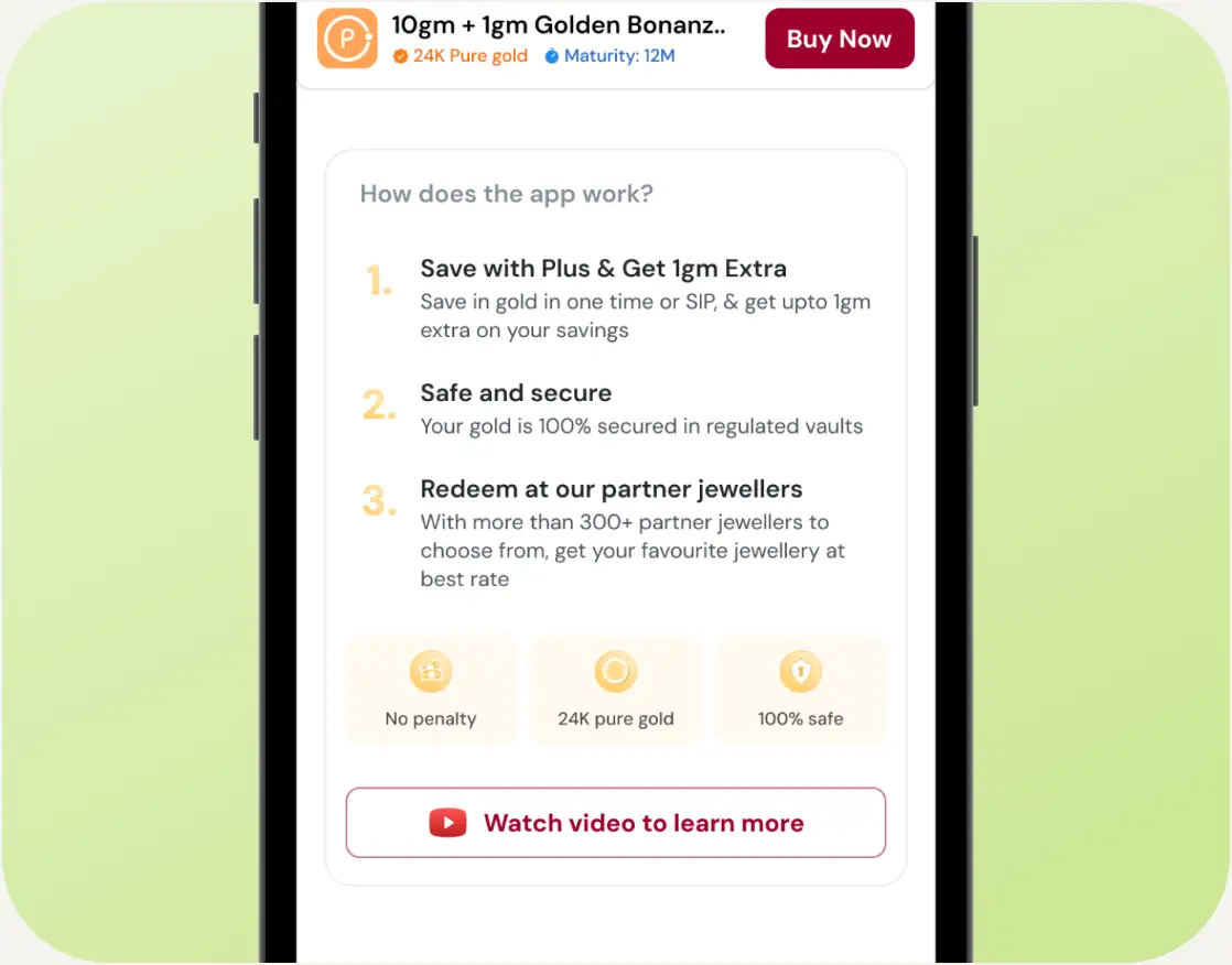
Clear Messaging
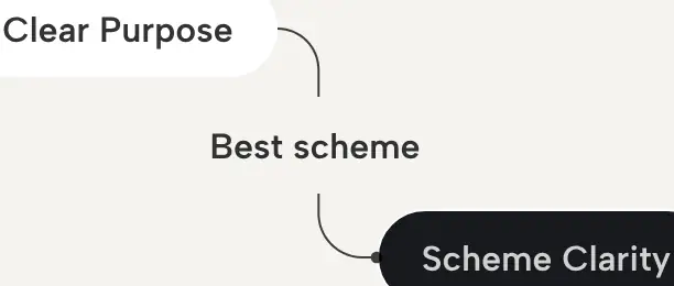
To make the scheme more understanding this section was added with better
UX writing
UX writing
Special Occasion
Introduction to a scheme which is based on special occasions gold purchase behaviors
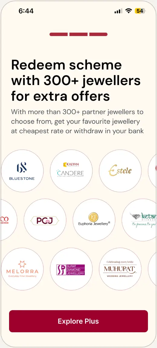
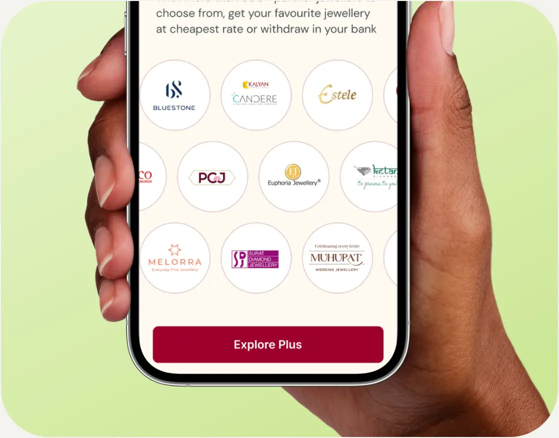
Trusted Jewelers
PlusGold’s collaboration with local and major jewelers boosts user trust and credibility, enhancing their confidence in making purchases through the platform.
Purchase Page
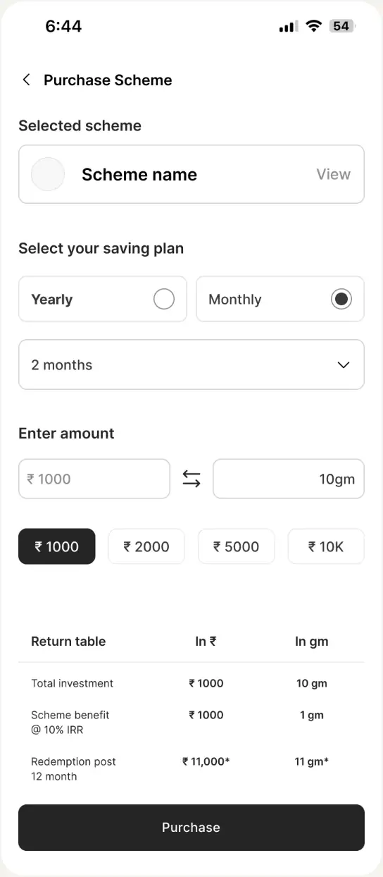
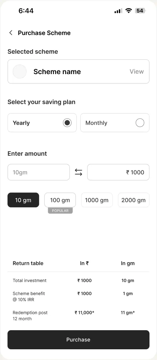
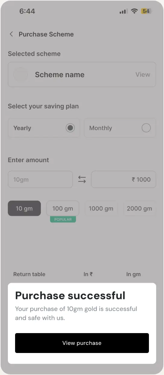
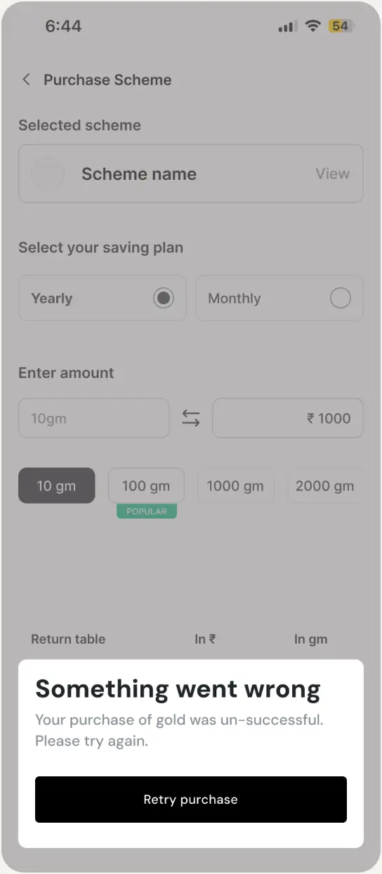
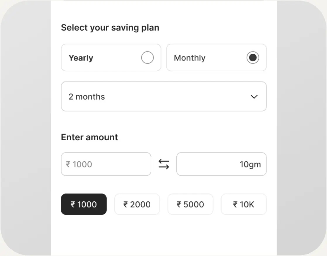
Simplified actions by allowing users to easily select the amount they want to invest. To streamline the process, I added predefined chips for quick, one-click selections. Additionally, a switch feature enables users to toggle between gold and rupees, offering a smooth and intuitive experience.
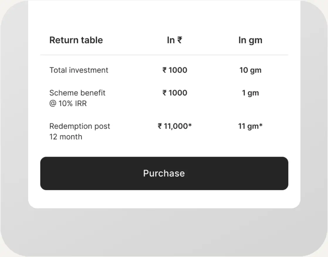
I also included a calculator section on the purchase page where users can directly see their potential profit by the end of the maturity period. This feature provides immediate, clear insights into their returns, helping users make more informed investment decisions and increasing confidence in the platform.
Final UI & Edgecases
Onboarding
Showcasing partnered jewelers prominently on the platform boosts user trust and credibility, enhancing their confidence in making purchases.
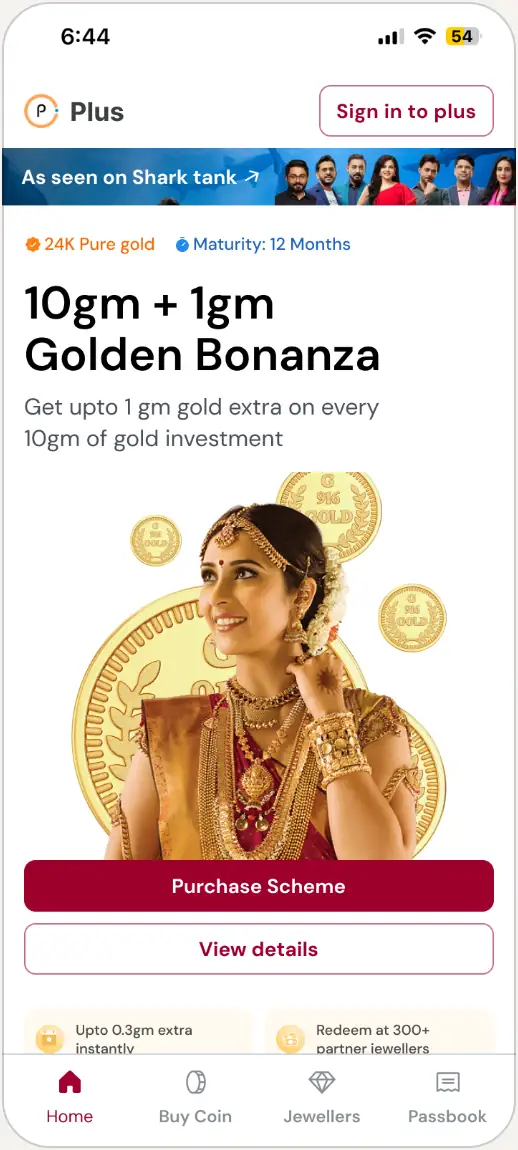
When users land on the home page, the first thing they see is the Main Scheme prominently displayed, showcasing its key USPs. The primary CTA is clearly highlighted, encouraging users to start the purchase flow immediately, creating a seamless entry point for transactions.
Final UI & Edgecases
Homepage
Home Screen was divided it into five section consisting:
Scroll Prototype
Purchase EP
About
Sales Video
Banner
More schemes
Partnered Jewelers
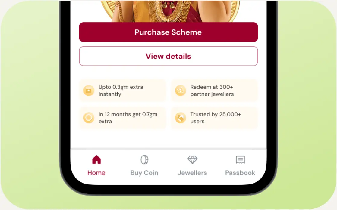
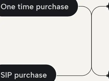
Important KPIs such as total returns, SIP buying option, and rewards are highlighted below the CTA, providing users with clear value propositions. This resulted in higher engagement.
The "How the App Works" section focusing more on the value proposition to higher engagement rates and increased trust in the app's offerings.
Small interaction here in which the primary CTA i.e. the selling scheme sticked on top while scrolling.
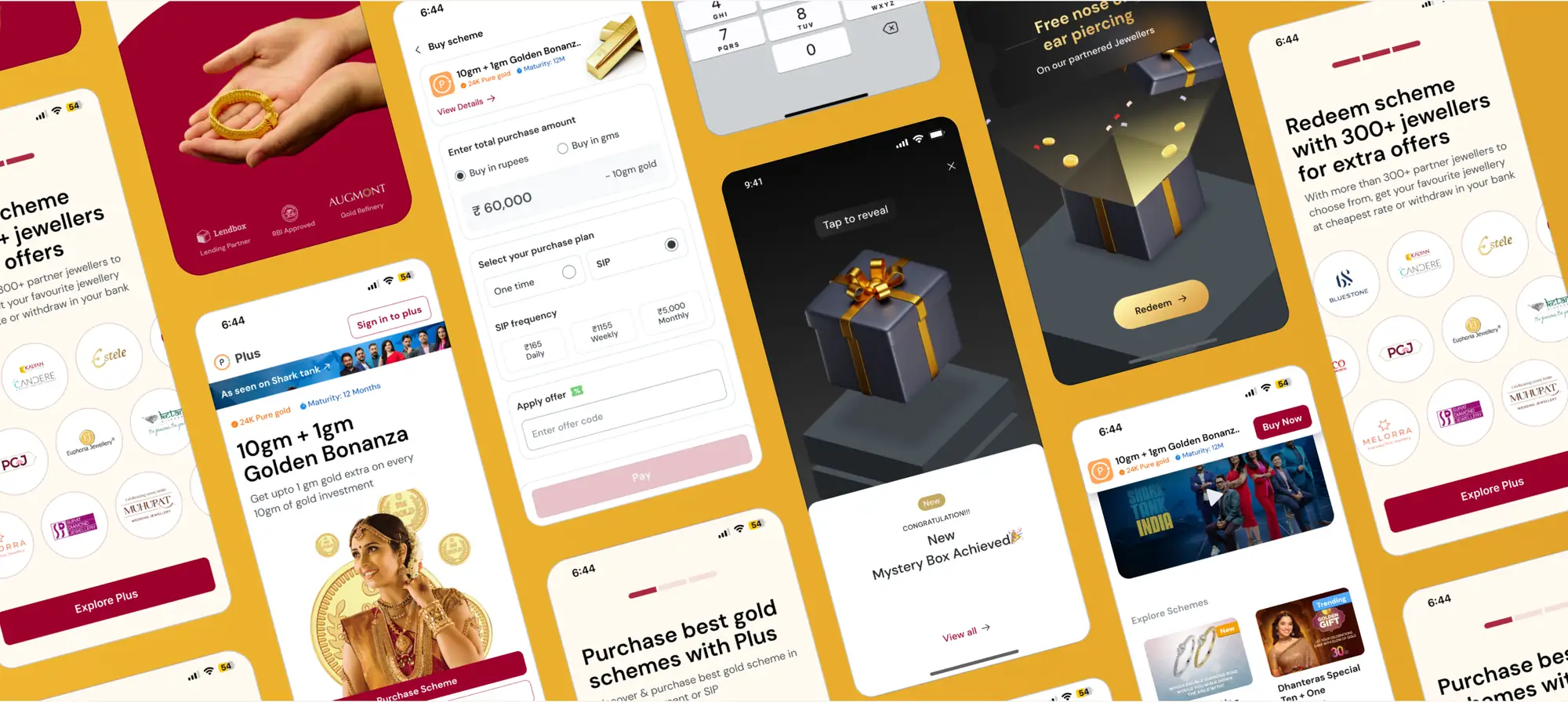
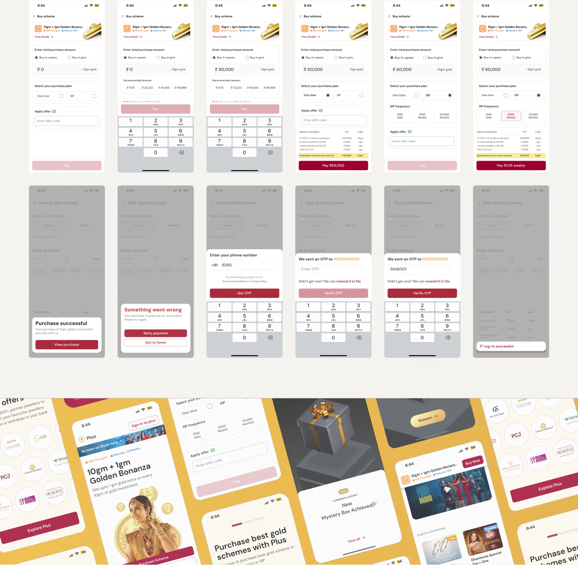
Purchase Flow screens
Key wins
Simplified onboarding increased user retention and first-time purchases.
Clear messaging and streamlined flows led to higher engagement.
Partnerships with trusted jewelers boosted user trust and confidence.
Fin.
Improving User Onboarding and First-Time Purchases
PlusGold, a fintech company specializing in gold investments, faced a high uninstall rate and low engagement with first-time purchases.
Scroll Down
Objective
Increase on-boarding conversion rate.
What I did
Led user research
UX flows and wireframes
Validated prototypes with users.
Final UI designs, covering edge cases.
Understanding the Problem
User Research
Method
Conducted user calls to gather insights directly from users. (38 users)
Process
Mapped out the key problems through interviews and identified.
Key Insights
1.Users were unaware of the product offerings.
2.App doesn’t seem safe
3.Complex journeys in the starting
User purchasing behaviour
•Purchases were only made on special occasions.
Previous Home screen
User Flow
Streamlined the user experience by mapping out clear, intuitive user flows for better navigation and engagement.
Wireframing
Onboarding - What app does?
Offering
Safe
Reedeem
Improved UX writing
I kept it simple, explaining how our product is trustworthy by focusing on its solid partnerships.
Home Screen
Purchase EP & Trust building
Purchase EP & Trust building
Toolbar and banner
KYC was removed to minimize complexity
Purchase CTA
60% of the screen consist information about scheme and primary CTA to push user to make their first purchase
Clear Messaging
To make the scheme more understanding this section was added with better
UX writing
UX writing
Special Occasion
Introduction to a scheme which is based on special occasions gold purchase behaviors
Trusted Jewelers
PlusGold’s collaboration with local and major jewelers boosts user trust and credibility, enhancing their confidence in making purchases through the platform.
Purchase Page
Simplified actions by allowing users to easily select the amount they want to invest. To streamline the process, I added predefined chips for quick, one-click selections. Additionally, a switch feature enables users to toggle between gold and rupees, offering a smooth and intuitive experience.
I also included a calculator section on the purchase page where users can directly see their potential profit by the end of the maturity period. This feature provides immediate, clear insights into their returns, helping users make more informed investment decisions and increasing confidence in the platform.
Final UI & Edgecases
Onboarding
Showcasing partnered jewelers prominently on the platform boosts user trust and credibility, enhancing their confidence in making purchases.
When users land on the home page, the first thing they see is the Main Scheme prominently displayed, showcasing its key USPs. The primary CTA is clearly highlighted, encouraging users to start the purchase flow immediately, creating a seamless entry point for transactions.
Final UI & Edgecases
Homepage
Home Screen was divided it into five section consisting:
Scroll Prototype
Purchase EP
About
Sales Video
Banner
More schemes
Partnered Jewelers
Important KPIs such as total returns, SIP buying option, and rewards are highlighted below the CTA, providing users with clear value propositions. This resulted in higher engagement.
The "How the App Works" section focusing more on the value proposition to higher engagement rates and increased trust in the app's offerings.
Small interaction here in which the primary CTA i.e. the selling scheme sticked on top while scrolling.
Purchase Flow screens
Key wins
Simplified onboarding increased user retention and first-time purchases.
Clear messaging and streamlined flows led to higher engagement.
Partnerships with trusted jewelers boosted user trust and confidence.
Fin.
Next case studyRocketPay